7

Dashboard Template

Hello everyone!

After the    post, I decided to start a new one. This will make it easier to follow the changes.

New features have been added:

  • Sticky buttons. Thanks to   CSS hacks, I was able to make the buttons component sticky. Now the buttons always remain visible to the top of the page as we scroll down.
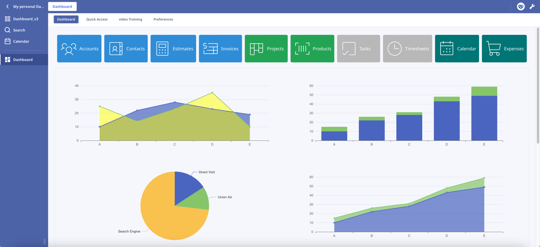
  • Scroll into View. By clicking a button the page automatically scrolls into the correspoding section. In the attached database press the first button "Accounts" to see it in action.

The combination of the above two features has the potential to transform the way we design our Dashboards. Like the one-page websites, we can present our content in sections on one long Dashboard.

In Safari works but I haven't check it in other browsers. Let me know if you find any bug.

What other functionalities would you like to see?

Leave here your suggestions, ideas or improvements!

Enjoy!

145 replies

null
    • Rafael Sanchis
    • Rafael_Sanchis
    • 2 mths ago
    • Reported - view

    Hi  works perfect on Chrome and Firefox on Android Tablet πŸ‘

      • szormpas
      • 2 mths ago
      • Reported - view

        Hi, thank you for checking this!

    • gold_cat
    • 2 mths ago
    • Reported - view

    Can the four charts be configured to provide a constant, real-time display of numerical data?


      • szormpas
      • 2 mths ago
      • Reported - view

        Hi, yes it can, I will present some real sample data in the upcoming releases!

      • gold_cat
      • 2 mths ago
      • Reported - view

       πŸ‘πŸ‘πŸ™‚

    • Database App Developer
    • vermau81
    • 2 mths ago
    • Reported - view

      this is nice. We can get the data in a table as well in this presentation, however my doubt still remains about the vertical sidebar layout. You have shown how we can successfully implement the buttons sidebar nd the charts on the right side.

    The only problem with that layout is that it looks like the whole individual CSS grid that we make still goes into one of the columns of the internal column layout of the Ninox design editor. That's why we cannot nave varied size columns. It picks up the largest height column and then aligns everything according to that height.

    I was just thinking if there was a way to have varied cell/column heights for internal Ninox column system or if we could just fit the CSS grid with varied cell heights on the right side, we can create the desired layout for the dashboard. I have already started studying the CSS grid.

    The point is that Ninox allows horizontal layouts and it's easy to layout the components in that way. We should give them feedback to maybe its time for them to change their layout system to a better one  (CSS Grid).

    Also regarding the charts, I was thinking that these charts are all using an external JS library that loads in the beginning. Aren't we supposed to use the internal charts view of Ninox ? Can we use the internal Charts and fit them into the CSS grid within the formula box?

      • szormpas
      • 2 mths ago
      • Reported - view

        Hi, 

      we could convert a Ninox Form into a CSS grid container.

      As a proof of concept create a new Page and then insert the following code inside a function field. Then try to add Ninox buttons to see what happens:

      html("<head>
      <style>
          .form{
            width:100%;
            height:100%;
            display: grid;
            gap: 0px 0px;
            grid-template-columns: 1fr 1fr;
            grid-template-rows: 1fr 1fr;
      }
      </style>
      </head>")
      
      • Database App Developer
      • vermau81
      • 2 mths ago
      • Reported - view

       Hi, I have already started learning the CSS grid and this is what I have made so far. I have defined "form" as the main Div in HTML and made other Divs as its child. I can't understand whether should I define "form" as the main Div or not 'cuz it is showing the form border twice.

      If I don't make "form" as the main Div, but name the main Div as "container" in HTML, the whole layout breaks.

      I have attached a snapshot (with broken layout where the main Div is named as "container" instead of "form" and the actual Ninox file (with desired layout where the main Div is named as "form").

      I have also attached the screenshot of the Visual Studio file where I am learning and practising the CSS  grid layout system.

    • szormpas
    • 2 mths ago
    • Reported - view

    Dashboard Template project major update (v4):

    • Elimination of the padding of the parent Ninox form. The buttons stick to the top of the form just below the Ninox Tab creating a sticky ribbon.
    • New text-line section dividers have been introduced.
    • The scroll-margin-top property of all section dividers has been set to 98px. By controlling the distance between the snap position of the section divider and the parent Ninox form, the former sits perfectly just below the buttons after scrolling.
    • A new sticky scroll-up arrow has been added. Always visible the clickable arrow lets the users easily return to the top of the form.

    With the above refinements, the basic structure of the dashboard is complete. It's a long, multi-section dashboard. There is a ribbon of ten buttons corresponding to the ten sections.

    Between section dividers, the users can add as many Ninox fields as they want. Bear in mind that each time you insert a new Ninox field into the dashboard you must manually increase the id number of the scroll-up arrow accordingly in the following line of code:

    .form .component:nth-child(14)
    

    Enjoy! πŸ™‚

      • gold_cat
      • 2 mths ago
      • Reported - view

       Thank you for your contribution.

    • szormpas
    • 2 mths ago
    • Reported - view

    Version 4.1

    Bug fix: On Chrome the "scroll-margin-top" property does not work. To fix this I had to use the alternative "scroll-padding-top" property that applies to the <div> where the vertical scroll bar appears. I discovered that this is the parent <div> with the class '.page-view>.object'

    I tested it in Safari, Chrome, and Firefox. It runs smoothly.

    PS. I wouldn't have had the courage to open my browser's developer console to explore the Ninox page <div> elements without   's encouragement.

      • Rafael Sanchis
      • Rafael_Sanchis
      • 2 mths ago
      • Reported - view


      Excelent now on Chrome and Android Tablet Perfect πŸ‘


      <script type='text/javascript'>
            setTimeout(function(){
              echarts.registerTheme('customed', {});
              var myChart = echarts.init(document.getElementById('" +
          chartId +
          "'),'customed');
              myChart.setOption(" +
          options +
          ");
            },1000);
          </script>"

      In my case the Graph is too much better place 1000 display faster than 100

      • szormpas
      • 2 mths ago
      • Reported - view

        thanks, I also noticed some problems with the initial appearance of the charts. I'll try the setting you suggest!

    • szormpas
    • 2 mths ago
    • Reported - view

    Version 5.0

    I have imported this dataset from Kaggle to demonstrate how we can visualize our Ninox data using the eCharts library.

    The new eCharts 'dataset' component has been adopted because it is convenient for separating data from configs and is easy to construct as an 'array of JSON' within the Ninox script.

    The legends are interactive, allowing you to click to hide/show the relevant series data.

    Although there is an initial steep learning curve, once you understand the basics of the chart components, the possibilities are endless, even for statistical analysis. I recommend the eCharts Handbook as a starting point.

    BONUS: A beautiful real-time analog clock, which is essentially a gauge chart that displays time data, for those who love clocks!

    Have fun! πŸ™‚

      • gold_cat
      • 2 mths ago
      • Reported - view

       Thank you, Sotirios Zormpas, for sharing. I would like to ask if the charts can be arranged differently depending on the device. For example, when accessing the database on an iPhone, the charts would only display in a single row because two rows might be too crowded.

      • szormpas
      • 2 mths ago
      • Reported - view

       Hi, I am working on it!

      • gold_cat
      • 2 mths ago
      • Reported - view

       Thank you, my friend. Thank you for your hard work!

      • gold_cat
      • 3 wk ago
      • Reported - view


      Hi friend, I’ve started researching the eCharts you shared and want to integrate it into my database. I’ve reviewed the code, but my data situation is a bit different, and I’d like to ask for your help.

      I’ve created a new table called *Sales Details*, and I want to display the total sales per person in the table. For example, Alexander has two records, so the bar chart should show 20. When the mouse hovers over Alexander’s bar, it should display the details of the two records:
      - 10, Sep 23, 2024
      - 20, Sep 23, 2024

      Is this achievable? Looking forward to your reply.

      • gold_cat
      • 6 days ago
      • Reported - view

       
      Hi, friend! I want to connect the data from the database to the following chart. I have tried many times. Can you help me?    If possible, I also want to connect all the data.

          data: ['Mon', 'Tue', 'Wed', 'Thu', 'Fri', 'Sat', 'Sun']
      let getCopy2 := (select Dog breeds);
      let DOGname := unique(getCopy2.Name);
      let newData := for loop1 in DOGname do
      let JEcount := sum(getCopy[Name= loop1 ].min_life_expectancy);
      if JEcount != 0 then
      {
      category: loop1,
      JEcount: JEcount
      }
      end
      end;
    • Ninox partner
    • RoSoft_Steven.1
    • 2 mths ago
    • Reported - view

    Thanks for sharing this piece of art!

      • szormpas
      • 2 mths ago
      • Reported - view

       Hi, I'm glad you like it. I have learned a lot working on this project!

    • szormpas
    • 2 mths ago
    • Reported - view

    Version 6.0

    New feature:

    Real-time weather data right to your home section by calling the tomorrow.io API. I've set the location to New York just to show you what it looks like! You can easily change the location 'Value' field inside the 'Settings' subtable. It accepts the following formats:

    • Latitude and Longitude (Decimal degree) location=42.3478, -71.0466
    • City name location=new york
    • US zip location=10001 US (2-letter code based on ISO-3166)
    • UK postcode location=SW1  

    I'm happy to leave my API Key so that everyone has a chance to test out the service. Just a quick heads-up, though, there are limits on requests (3/sec, 25/hour, 500/day). But there is a free account tier, so just create one and paste your API Key inside the 'Settings' subtable.

    This company seems promising but I am not sure how accurate the results we get are. If you know of a better weather API, I'd love to hear about it! 

    Improvements: 

    • Responsive layout for both the 'Home' CSS flexbox and 'Dog Stats' CSS grid. I used @media CSS queries to make it all work together seamlessly. On smaller devices, the layouts switch to a single column, which is great for viewing the charts one after the other.
    • No dependencies on external sources.  I've downloaded and saved the eCharts js library, the Phosphor icons stylesheet, and the weather codes into the 'Sources' subtable for you.

    All the best! πŸ™‚

      • gold_cat
      • 2 mths ago
      • Reported - view

       πŸ‘πŸ‘

      • gold_cat
      • 4 wk ago
      • Reported - view


      html("<head>
      <style>
          .charts-grid-container {
            width:100%;
            height:100%;
            margin: 0;
            padding: 0;
            display: grid;
            gap: 0px 0px;
            grid-template-columns: repeat(2, calc(100% / 2));
            grid-template-rows: repeat(2, calc(100% / 2));
           }
           .contain {
           object-fit: contain;
           }
          @media (max-width: 600px) {
             .charts-grid-container {
            grid-template-columns: 100%;
            grid-template-rows: 400px 400px 400px 400px;
                  }
              }
      </style>
      </head>
      <body>
      <div class='charts-grid-container'>" +
      "<div style='height:100%; width:100%; display: flex; align-items: center; justify-content: center;'>
      <img class='contain' src='https://share.ninox.com/c732bkfkc9i49ypp5s4myt5uybsniskj0g09' alt='dog breeds' width=50% height=80% />
      </div>
      </div>
      </body>")
      

      Hello, my friend, I need to center this puppy picture. If the two yellow lines are the upper and lower borders of the formula box, the picture should scale up or down according to the size of the formula box (without changing its aspect ratio). How should I modify this code? Thanks for the help!

      • szormpas
      • 3 wk ago
      • Reported - view

        Hi. Try the following code inside a formula field:

      html("
      <style>
           .contain {
           object-fit: contain;
           }
      </style>
      <div style='height:100%; width:100%; display: flex; align-items: center; justify-content: center;'>
      <img class='contain' src='https://share.ninox.com/c732bkfkc9i49ypp5s4myt5uybsniskj0g09' alt='dog breeds' width=100% height=100% />
      </div>")
      

Content aside

  • 7 Likes
  • 10 hrs agoLast active
  • 145Replies
  • 1465Views
  • 12 Following