0

Assistance with producing graphs

Hi All

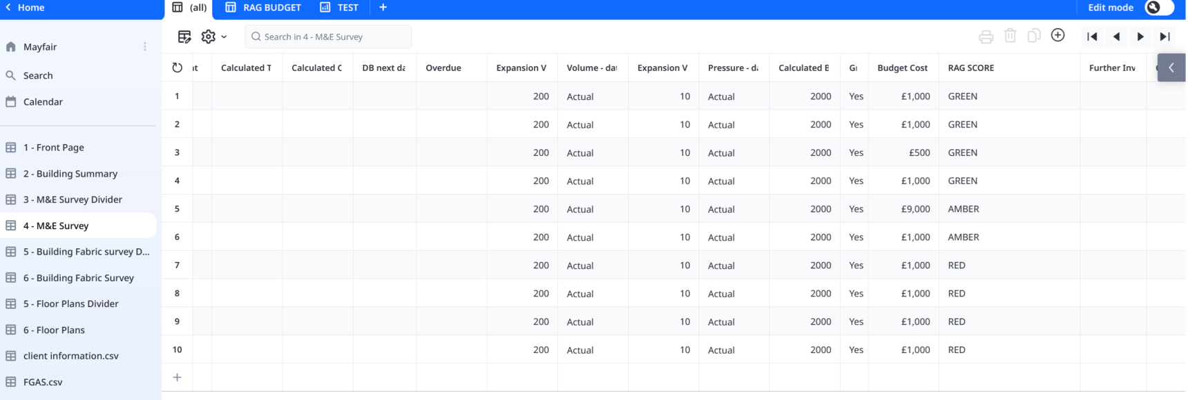
I use Ninox as an asset collection tool.  So my databases can be 200 lines or 5000 lines.  

Part of the data I collect is the condition score - Red - Amber - Green

And I also put a budget to each asset.  

I would like to produce a graph that will add up all of the budgets against each condition score

So for example

Budget Costs     RAG Score

£50,000               GREEN

£10,000               AMBER

£50,000               GREEN        

£10,000               AMBER

£10,000               GREEN        

£5,000                 AMBER

£5,000                 AMBER

£20,000               GREEN     

£10,000               GREEN       

 £20,000               AMBER

£50,000               RED

The total of all the Green assets could be say £140,000, Amber could be £50,000 and Red could be £10,000

It would be great to show this in a graph.  

And as I carry out the survey it start to autofill the graph.

And if the graph can be coloured Red, Amber and Green that would be great


Is there a way to do this?

13 replies

null
    • Fred
    • 2 wk ago
    • Reported - view

    Hi Peter -

    Can you upload a sample of your DB? I ask this because creating graphs using Ninox means having a table that has your data organized in the way you want to see.

      • Peter_Oram
      • 2 wk ago
      • Reported - view


      Thanks for the reply.

      My database under 4 - M&E Survey, in the spreadsheet has a lot of columns.  But for doing a graph I am looking for breaking down the in a pie chart and or bar chart the total of all of the Red, the Amber and the Green

    • Fred
    • 13 days ago
    • Reported - view

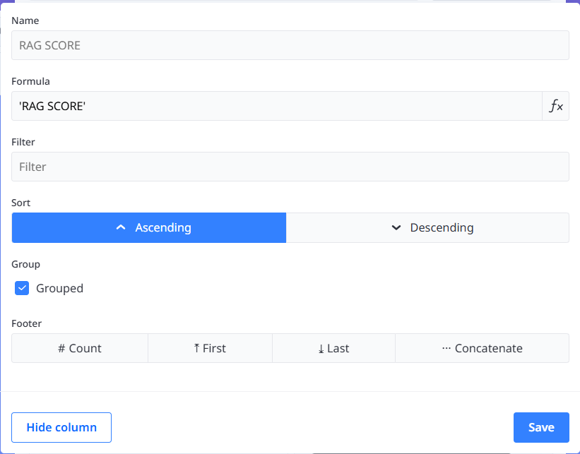
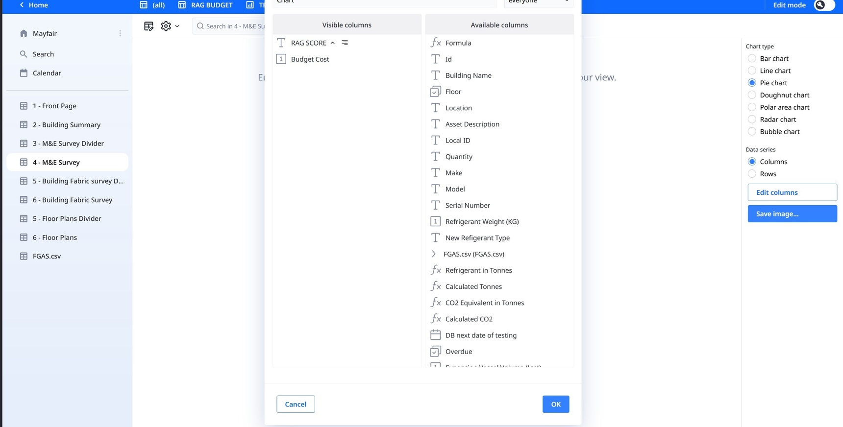
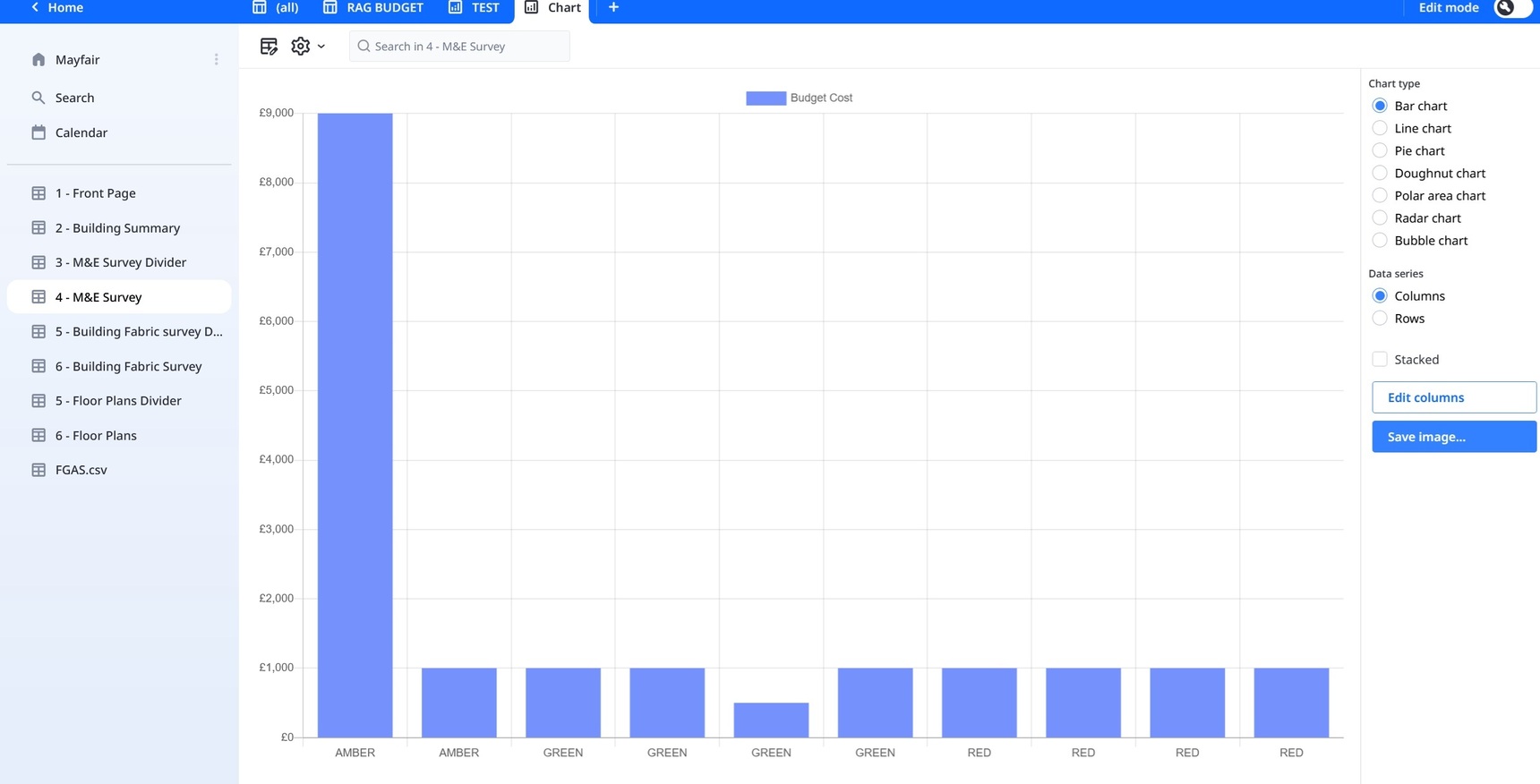
    If you add a chart view or a chart field, the main part is the same, Edit Columns. In either chart, you select Edit Columns, then add back:

    1) RAG SCORE, check the Grouped checkbox

    2) Budget Cost, under Footer, select Sum

    The order is very important, the first column becomes your x axis and the 2nd column is your y axis.

    If you use a chart field, then under Formula you could use: 

    select '4 - M&E Survey'
      • Peter_Oram
      • 12 days ago
      • Reported - view

       Thanks for the message.  

      I had tried the group tick box against RAG.  But when I click save it comes up with the following error

      -------

      Error: Chart has no data. Please configure at least one number column in your view

      -------

      Sorry not sure where you mean I should put the formula?

      I have attached 2 images.  1 showing what the visible coumns are.  And the symbol next to T Rag Score is for grouped.  This brings up the error


      The 2nd image is where all I have done is unticked the grouped box

      • Fred
      • 12 days ago
      • Reported - view

       Can you upload a sample DB? Not just a picture but a copy of your DB? Just remove any personal information.

    • Fred
    • 11 days ago
    • Reported - view

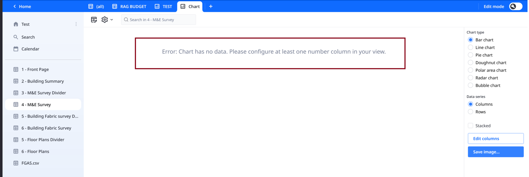
    So I clicked on Grouped and got no error message. I'm using the public cloud.

    I also summed Budget cost and got:

      • Peter_Oram
      • 11 days ago
      • Reported - view

       Hi.  Thanks for looking at this.  I have gone back onto my DB and done it again and I still get the error code, please see the below.  Could you resend me my DB when you have got it working so I can try uploading it.  


      Also for the DB I sent you over there are a lot of cells empty only because I haven't filled them out.  I only inputted some data to try and get this part to work.  I need to keep all of this data in 1 place so i can export it to Excel and send to my clients.  

      • Fred
      • 11 days ago
      • Reported - view

       Here is what works for me. I also ran it under the MacOS app saved locally and had no issues.

      • Peter_Oram
      • 11 days ago
      • Reported - view

       Thank you very much.  I see I missed the selecting Sum button on the budget costs.  

    • Fred
    • 11 days ago
    • Reported - view

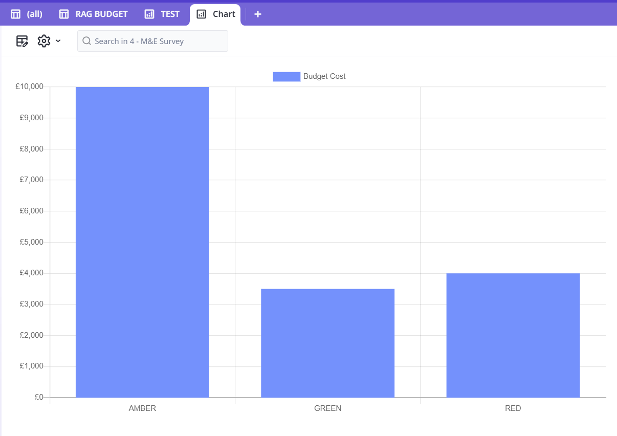
    Recommendation, when you find yourself creating multiple fields with the same name but differentiated by a number Image, Image 2, Image 3, etc. You should consider making a child table. That way you can have 1 image or 100,000 images without having to create a field for each one.

    • Peter_Oram
    • 11 days ago
    • Reported - view

    And then the next Q, we we have his sorted.  Just like on the [All] tab where you can select print and it takes you to creating a page layout.  I use this alot for my surveys.  How can you do this with the graph.  As I would like the graph to be nested in a PDF where I can put standard text on the page

    • Peter_Oram
    • 11 days ago
    • Reported - view

    And is there a way to change the colours on the graphs?

      • Fred
      • 10 days ago
      • Reported - view

       I don't use charts and I can't find an obvious way. Anyone?

Content aside

  • 10 days agoLast active
  • 13Replies
  • 49Views
  • 2 Following