
Assistance with producing graphs
Hi All
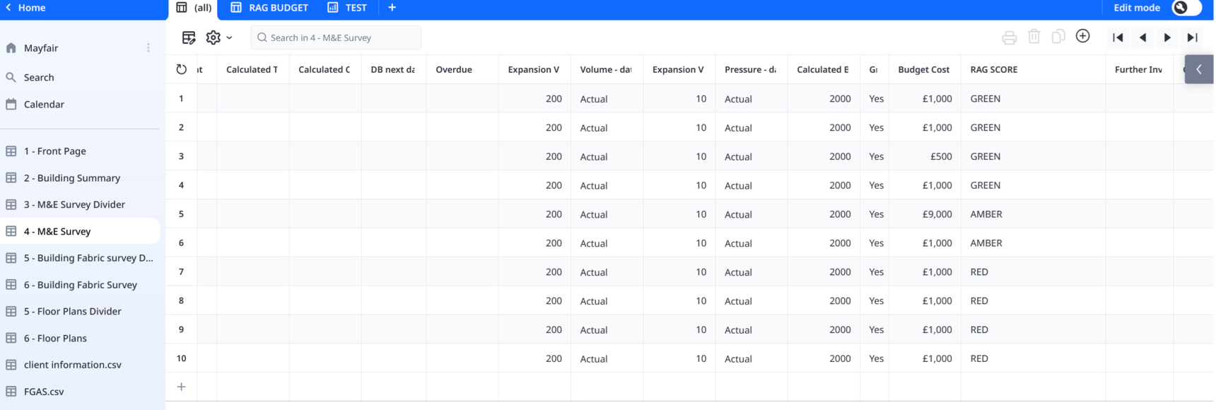
I use Ninox as an asset collection tool. So my databases can be 200 lines or 5000 lines.
Part of the data I collect is the condition score - Red - Amber - Green
And I also put a budget to each asset.
I would like to produce a graph that will add up all of the budgets against each condition score
So for example
Budget Costs RAG Score
£50,000 GREEN
£10,000 AMBER
£50,000 GREEN
£10,000 AMBER
£10,000 GREEN
£5,000 AMBER
£5,000 AMBER
£20,000 GREEN
£10,000 GREEN
£20,000 AMBER
£50,000 RED
The total of all the Green assets could be say £140,000, Amber could be £50,000 and Red could be £10,000
It would be great to show this in a graph.
And as I carry out the survey it start to autofill the graph.
And if the graph can be coloured Red, Amber and Green that would be great
Is there a way to do this?
2 replies
-
Hi Peter -
Can you upload a sample of your DB? I ask this because creating graphs using Ninox means having a table that has your data organized in the way you want to see.
Content aside
- 13 hrs agoLast active
- 2Replies
- 16Views
-
2
Following