8

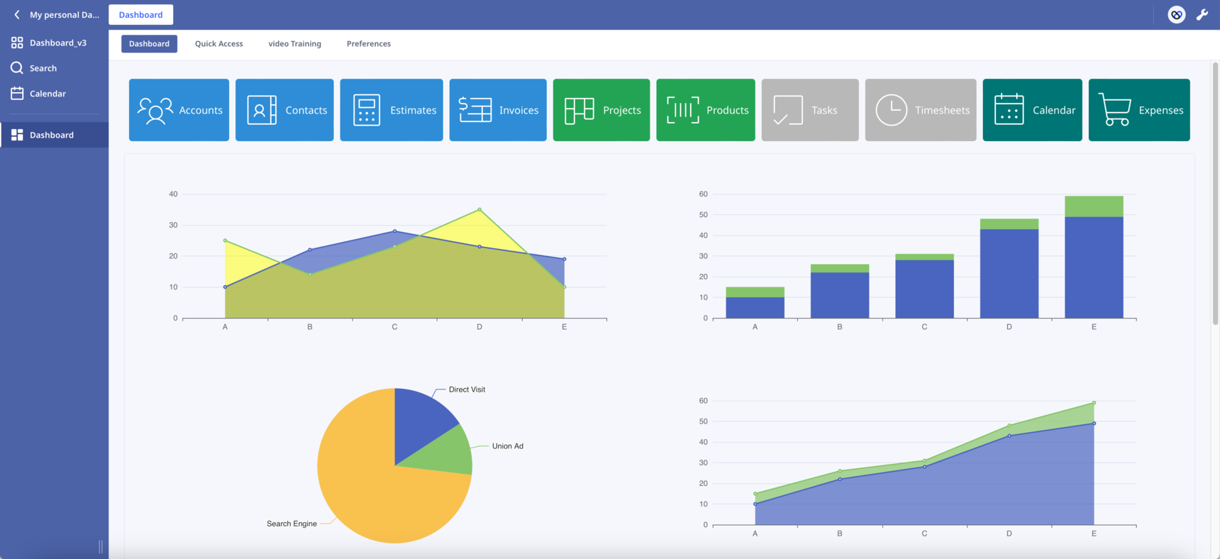
Dashboard Template

Hello everyone!

After the    post, I decided to start a new one. This will make it easier to follow the changes.

New features have been added:

  • Sticky buttons. Thanks to   CSS hacks, I was able to make the buttons component sticky. Now the buttons always remain visible to the top of the page as we scroll down.
  • Scroll into View. By clicking a button the page automatically scrolls into the correspoding section. In the attached database press the first button "Accounts" to see it in action.

The combination of the above two features has the potential to transform the way we design our Dashboards. Like the one-page websites, we can present our content in sections on one long Dashboard.

In Safari works but I haven't check it in other browsers. Let me know if you find any bug.

What other functionalities would you like to see?

Leave here your suggestions, ideas or improvements!

Enjoy!

186 replies

null
    • szormpas
    • 3 wk ago
    • Reported - view

    Version 10.0

    View Widget

    Hello everyone,

     recently mentioned he'd like to be able to change the height of the rows in the View element on the fly.  and I agreed that it'd be easier to build from scratch than try to modify the Ninox code. 

    Building a View component from scratch is no easy task, so I decided to go with a ready-made library. 

    After doing a lot of research, I opted for Ag-Grid. They claim to be the best JavaScript grid in the world, and my experience has been great so far.

    My goal was to build a Widget that could completely replace Ninox's native View element and, if possible, have more functionality.

    I'm happy to present my View Widget with the following features:

    • Add a new record inline using the pinned top row.
    • Select and delete one or more records.
    • Modify any cell inline.
    • Row indexing.
    • Intuitive sort and filter capabilities (simply click on the column header to sort).
    • Pagination.
    • Extensive customization (try the Theme Builder).
    • Compact or normal mode.

    The all-new View Widget is basically a Ninox table inside a formula field, plus a whole lot more.

      what are your thoughts on the compact mode? Is it as compact as you'd like?

    Enjoy! 🙂

      • szormpas
      • 3 wk ago
      • Reported - view

        , Great work on the date comparator! It's working perfectly. I checked it out and it does exactly what we need.

      Many thanks for your contribution 💪

      • Kruna
      • 2 wk ago
      • Reported - view

       ok, no problem.

      Iam also using the public cloud, except on desktop, but Not the browser.

      Anyway, maybe there is a solution somewhere in the www - I will just have to look for it😅

      • gold_cat
      • 13 days ago
      • Reported - view

      Hi friend, can Ag-Grid be used offline without using the API? Does the code need to be modified?

      • szormpas
      • 13 days ago
      • Reported - view

        Hi, you only need the Ninox API to add a new record or modify an existing one.

      • gold_cat
      • 13 days ago
      • Reported - view

       Hi, friend! If I use the offline version, do I also need the API?

    • szormpas
    • 2 wk ago
    • Reported - view

    Hi, following the discussion here, I just wanted to remind you that you need to be careful when sharing the Ninox API Key with the Ninox frontend (client-side).

    If you're the only user of your application, then it's probably fine. Otherwise, you should be aware that someone else using your application could potentially access your Ninox API Key.

    • cyan_silver
    • 8 days ago
    • Reported - view

    We are a construction management company, and we do quality management for construction projects. I would like to ask you if there is a way to read the picture data in NINOX if you use an IPAD to work offline when there is no Internet at the construction site. At the end of the day The picture will not be blank (I modified the use case of Figure 1 to Figure 2, hoping that the base map can support the offline function to avoid becoming the situation of Figure 3 in the offline state) Thank you

      • szormpas
      • 7 days ago
      • Reported - view

        Hi, in my example the floor plan is saved into an image field inside the Photos subtable. I'm not sure how Ninox handles files in image fields when you're offline. If you can open an image field offline, you should be able to see the base map using the Leaflet library. I don't use my database offline, so I can't help you further.

    • szormpas
    • 4 days ago
    • Reported - view

    Version 11.0

    Floating Widget

    Hello everyone,

    Tooltips and popovers are really useful and they make a massive difference to the user experience.

    While it's pretty straightforward to create a floating element with CSS, positioning it in relation to other DOM elements can be tricky.

    Luckily, there's a great low-level library called Floating UI that helps us position floating elements such as tooltips and popovers perfectly.

    The new Floating Widget makes it super easy to add tooltips and popovers to your Ninox dashboard. I've kept the CDN links in place, so you can just copy and paste the code into a function field and you're all set.

    To see what the library can do, move the buttons to the edges of the viewport and watch how the floating elements move around.

    Have fun! 🙂

      • szormpas
      • 3 days ago
      • Reported - view

         I just wanted to share something I found out today, building on what I said in my last post.

      There's a new Popover API that's now available in all three major browser engines. It's a game-changer! It's now baseline, and it's newly available as of April 16, 2024.

      With this native web feature, we can create floating user interface elements and avoid common issues related to z-index stacking, dismissals, poorly implemented accessibility, and more.

      It's really straightforward to create a popover with this API. Just copy and paste the following code into a formula field and you'll see what I mean:

      html("<style>
      .floating-button {
          padding: 10px 20px;
          font-size: 14px;
          color: white;
          background-color: #007bff;
          border: none;
          border-radius: 4px;
          cursor: pointer;
      }
      [popover] {
          width: max-content;
          padding: 10px;
          background-color: #fff;
          border: 1px solid #ddd;
          border-radius: 4px;
          box-shadow: 0 4px 8px rgba(0, 0, 0, 0.1);
          transition: opacity 0.2s ease;
      }
      </style>
      <button class='floating-button' popovertarget='popover' popovertargetaction='toggle'>Click me</button>
      <div id='popover' popover>
          <h2>Text</h2>
          <textarea rows='6' cols='50' placeholder='I am a popover built using the all-new native popover web API. I have got built-in accessibility features and toggle control, so I am a great way to build intuitive and dynamic interfaces...'></textarea>
          <button class='floating-button' style='float: right; margin-top: 10px;' popovertarget='popover' popovertargetaction='hide' onclick='saveText();'>Add</button>
      </div>
      <script>
      function saveText() {
          // add logic here
      };
      </script>")
      

      The Popover API puts the floating element in the centre of the viewport by default. If you want to position the popover relative to the button, you can combine it with the Floating UI library like I did in the attached Dashboard_v11_1.

      There's more good news: the CSS Anchor Positioning API is on its way! Soon, we won't need a single line of JavaScript to perfectly position our popovers relative to an anchor element (e.g. button). Unfortunately, it isn't supported on all browsers yet, but you can explore its features here:

      Enjoy! 🙂

      • szormpas
      • 2 days ago
      • Reported - view


      I'm happy to report that Ι've found a way to use the new Floating Widget to display custom tooltips for all Ninox fields!

      We all know that the Ninox native tooltips are pretty basic, lack customisation and are really slow. On the other hand, the new ones have some great features:

      • Quick show/hide on mouse hovering.
      • Fully customisable.
      • Show any data from your Ninox database.

      To make this happen, I've followed these steps:

      1. I used the Ninox classes ".form" and ".component:nth-child( )" to identify the target Ninox field.
      2. I built a tooltip with the Popover API.
      3. I've got the tooltip positioned perfectly in the Ninox field using the Floating UI library.

      If you're ready to give custom tooltips a try, just pop the following code into a formula field:

      html("<head>
      <style>
      .tooltip {
          width: max-content;
          max-width: 300px;
          background: #2D313B;
           color: white;
           font-weight: 600;
          padding: 10px;
          border-radius: 4px;
          font-size: 14px;
      }
      </style>
      </head>
      <body>
      <script src='https://cdn.jsdelivr.net/npm/@floating-ui/core@1.6.8'></script>
      <script src='https://cdn.jsdelivr.net/npm/@floating-ui/dom@1.6.12'></script>
      <div id='tooltip-3' class='tooltip' popover>
      I am a custom tooltip attached to this Ninox text field. I am powered by the Popover API and the Floating UI library, so I am fully customisable, move around based on the space I have, follow the element as it moves, and adjust to fit within the viewport.
      </div>
      <script>
      setTimeout(function(){
      const ninoxTextEl03 = document.querySelector('.form .component:nth-child(26)');
      const tooltipEl03 = document.getElementById('tooltip-3');
      ninoxTextEl03.addEventListener('mouseenter', function() {
          tooltipEl03.style.position = 'absolute';
          tooltipEl03.style.inset = 'unset';
          tooltipPositionUpdate(ninoxTextEl03, tooltipEl03);
          tooltipEl03.showPopover();
      });
      ninoxTextEl03.addEventListener('mouseleave', function() {
          tooltipEl03.hidePopover();
      });
      function tooltipPositionUpdate(element, tooltip) {
      FloatingUIDOM.computePosition(element, tooltip, {
          placement: 'bottom-start',
          middleware: [FloatingUIDOM.offset(0), FloatingUIDOM.flip(), FloatingUIDOM.shift({padding: 5})],
      }).then(({x, y}) => {
          Object.assign(tooltip.style, {
              left: `${x}px`,
              top: `${y}px`,
            });
        });
      };
      },100);
      </script>
      </body>")
      

      Then just replace the number '26' in code line 23 with the ascending index of your Ninox field and you're good to go!

      If you want to make the formula field invisible, just set the background and border color to transparent.

      Enjoy! 🙂

Content aside

  • 8 Likes
  • 2 days agoLast active
  • 186Replies
  • 1980Views
  • 13 Following